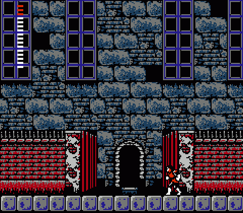
By far, Mansions represent the point at which Simon’s Quest‘s reach exceeds its grasp. They’re an interesting attempt at spicing up the Castlevania style with something new and different, but they fall short of the mark due to poor design and sheer monotony.

If Simon’s Quest mimics the shape of an RPG, Mansions play the role of dungeons. Five of them dot the countryside, and each one contains a different key relic (one of the Dracula bits Simon needs to burn to rid himself of the curse he toils under). This concept, in itself, seems promising enough. But can you imagine playing an RPG where every dungeon takes the same form (each a cave, or every one a castle, etc.) and consists of the same graphic elements switched around into different colors? That would be pretty boring. And it’s boring here, too.
Another problem: No one seems to have put any real thought into the actual layouts of the Mansions. Think on Castlevania, a game where each and every background tile was clearly arranged with care and consideration. Each level carried its own theme, with minor (and sometimes major) visual changes telling a kind of story as you progressed through that stage. You moved from underground waterway to courtyard to dungeon service entrance in one stage, then from dungeon to alchemy lab to grand hallway the next. The “interactive” elements of each level — the blocks Simon walked across — occupied specific space by deliberate design. Background tiles connected to foreground blocks to justify each and every platform and hazard. Castlevania brought logical architectural design to platformers, and I love it for that.
Now, throw all that away for Mansions. Evidently drunk on the ability to scroll the screen freely in all directions due to more advanced NES tech and programming, the level designer(s) behind Simon’s Quest created the Mansions as five willy-nilly messes. Each one functions as a kind of maze, and that’s all well and good, but they’re all haphazard and lack the obvious care and consideration that went into Castlevania. But hey, free-scrolling!
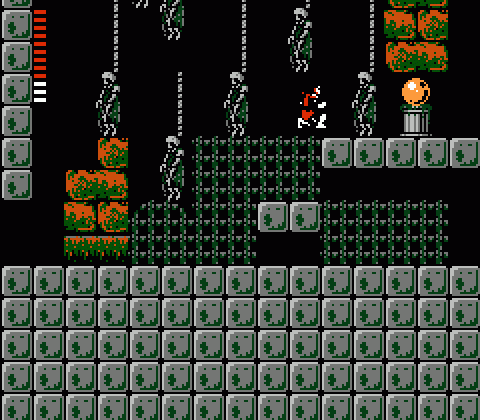
Mansion design falls short on several levels. Despite the complete lack of visual variety, the real issue is simply that the layouts are uninspired and workmanlike. Mansions feel less like interesting, “real” spaces to navigate and more like paths designed simply to make the player cover a lot of ground in order to acquire the MacGuffin within. Their internal architecture doesn’t obey any sort of logic — especially that one top-heavy Mansion with the large, pointless void in the center of the upper area — and they’re packed with cheap traps. The game loves to throw illusory floors at you, which will kill you the first time you wander into one and plummet to the spikes or water below. You can avoid these by watching enemy movement patterns (skeletons will never walk over a mirage) or chucking holy water liberally… which you kind of need to do anyway, since clue books and secret paths are hidden inside blocks.
The free-scrolling design of the Mansions usually creates more trouble than benefit, unfortunately. Enemies do that 8-bit thing where they respawn if their spawn point is within x number of pixels of the screen’s edge, so you fight the exact same enemies constantly. A good many of the interior spaces link up via staircases, which Simon climbs slowly and in a very vulnerable way. The game loves to spawn enemies which mingle at the top or bottom of staircases, roaming back and forth in a way that guarantees you simply can’t avoid taking a hit once you reach the top (unless you use a very expensive Laurel). And to top it off, the music isn’t even that great.

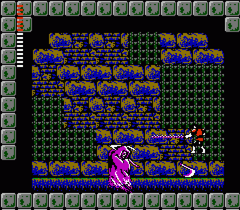
Two of the Mansions contain bosses. Oh, no! You think. I have to beat the Grim Reaper again! Yeah, I’ll talk about that in a future update, but this part of the game sucks for the exact opposite reasons that Death was so troubling in Castlevania.
Despite these complaints, there are a few neat features to Mansions that give each a hint of their own personality. The first begins with an invisible moving block that can only be seen if you hold the White Crystal — which would be an unfair hurdle for first-time players since you have to make the crystal your active item to enjoy its benefits. Since that’s the only key item you can possess at that point, though, it works out pretty well. In a later Mansion, the moving block reappears, but it’s used in a different way: It runs along a horizontal path along a platform, creating a stepping stone for Simon to reach the artifact while potentially scraping inattentive players into the water. And my favorite Mansion detail: Rover Mansion, the one located under Lake Yuba, may be infuriatingly difficult to find for the uninitiated, but when you climb to the top floor of the Mansion you’ll notice the lake’s water above the roof. A nice detail that demonstrates the designers weren’t totally asleep at the wheel.
Functionally, the most useful thing about Mansions is the way the game clock stops while you’re inside. This makes them good places to farm for cash and experience (which are weirdly linked: You don’t get experience for killing enemies, just for collecting hearts) without mucking up the endings. Or mucking them up worse than the programmers did, anyway. Each Mansion/area of the game has a level cap, so you can’t grind all the way up to maximum experience in the first Mansion, though. Konami is on to you and your cheating ways.
Anyway, the point of each Mansion is to buy an Oak Stake and plunge (throw) it into a relic container on a pedestal and claim the warm Dracula nugget within. Thusly:

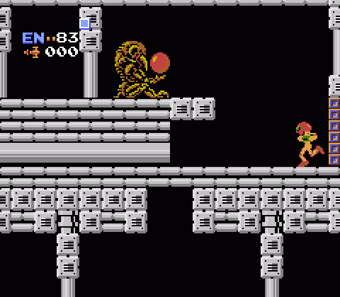
Man, this reminds me of something. I wish I could put my finger on it…

Ah, yes. That’s it.
If only there were a word that encapsulated the commonalities between these two series and their shared emphasis on action, character empowerment, and exploration… oh well.
I rather liked the music in the mansions, personally…
I’ve always liked pretty much all of Simon’s Quest’s music, but I suppose I can see where the tune could get a bit repetitive.
Also, the word you’re looking for is Castleroid, right? 😉
The mansions are definitely the low point of the game, being a maze of staircases, traps, and easily respawned enemies set to repetitive palette swapped scenery. And that vertical scrolling looks really jerky after Super Mario Bros. 3’s innovations in diagonals.
Actually, in some ways Castlevania II comes off like it didn’t have the time or budget that the original did, just being more obvious with the mansions. The slick overhead UI of the original’s been replaced with a vertically aligned set of solid color rectangles, with most of the vital info off in the menu screen. The countryside itself connects in pretty inconsistent ways, with at least one transition to a forest screen setting you up for an unexpected drop. The holy water doesn’t even make flames.
The word you’re looking for is Samusbelmondo
Granted, there’s only so many ways you could draw a circle at that scale on the NES, but I never noticed that - the highlight aside - the Mansion orbs and and the Chozo spheres are practically palette-swaps of the same sprite. Damn, son.
Also, lookit all dem dollar signs.