And now: The world. Or, if you prefer, ザ・ワールド
If Simon’s Quest falls apart in the Mansions and annoys in towns, it shines in the world beyond those locations. I don’t know why all five Mansions look exactly alike, or why they’re so boringly constructed, but I’m going to guess that it’s because all the detail and attention went into the overworld.
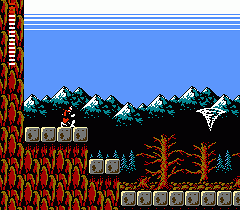
I mean, look at that. That screen is quintessential NES-era Konami right there. The deft use of the system’s minimal color palette, the minute detail and texture, the glorious contrast and outline of the distant mountain peaks, the iconic two-color sky gradient. Just wonderful.
But it’s not just the overworld’s visual design that excels — though certainly that is unimpeachable! What really makes Simon’s Quest‘s world so brilliant is its open, interconnected design. It’s not entirely free-roaming, as it’s blocked off at key spots by obstacles and puzzles that can only be surmounted by acquiring items and skills, but neither is it entirely linear. Discovering the links and connections between Transylvania’s different areas is a good part of what make’s Simon’s Quest so entertaining, and the variety of the areas you travel almost makes up for the crappy monotony of the Mansions.
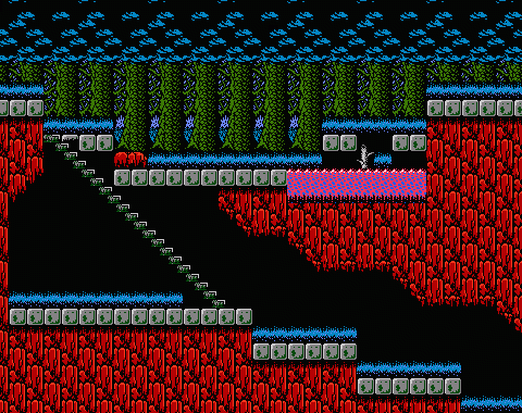
Transylvania as seen in Simon’s Quest consists primarily of a single large loop that runs in an endless circle, from which a number of alternate paths and spurs branch away and lead to important destinations. Mansions, alternate towns, Castlevania. The trick is figuring out how to get there, which is to say deciphering the obnoxious lies of those creeps who populate the towns.
Transylvania’s overworld is built on more of the logic of the original Castlevania’s architectural construction than the Mansions are. There are still bits that seem like arbitrary platformer design, like the blocks hovering above the magenta swamp above (what’s holding them up there!?). And who knows why someone built staircases in the middle of the forest. But if you can look past the magical hovering platforms over the water, Simon’s Quest has some well-designed areas and interesting hazards to overcome. It reminds me of Goonies II at times — not in terms of structure or appearance, but simply in the way some of the most interesting areas appear near the end of the game in single locations that you breeze through almost too quickly to appreciate. Like the drainage system below:
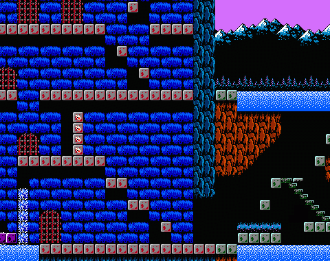
Simon’s Quest consists of huge, repetitive mansions and half a dozen identical towns. But between them you have plains, and rivers, and bridges…
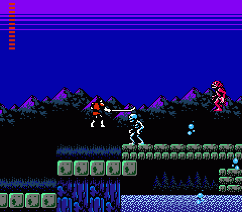
…lakes, swamps, wastelands, murky woods…
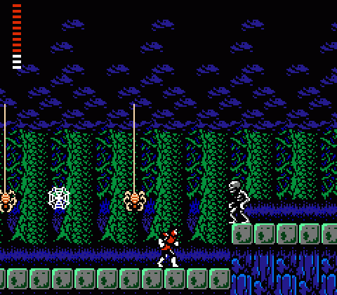
…(more like Mirkwoods, am I right?), rocky ravines, caverns, and cemeteries…
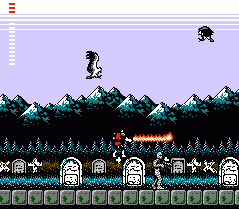
All interlocking, all connected, all bound together with towns and Mansions. Getting around doesn’t always make sense, but once you allow for inexplicable crystal-based pathways, the world of Simon’s Quest in retrospect became one of the first action games to try and create such an expansive, interesting, diverse, explorable world.
Simon’s Quest may seem kind of baffling and opaque in retrospect. But in 1988, this was great stuff. Big, inventive, expansive, ambitious. And you could totally whip mummies to death (re-death?) with a flaming whip. Amazing.
I figured out early on that Simon’s Quest went by the “up = north”/”down = south” rule, in-game. But of course that’s the least hokey part of the game.
I always subscribed to the egoraptor view on this game: its biggest flaw is the utter lack of threat level and positioning of enemies. It’s a good thing Konami delivered aesthetically for the most part, as you’ve summed up so far.
This is probably one of the things I love most about this game, if not the thing. It is what I would like to see more of in Castlevania, and I would love a remake of this game just to see it brought up to modern standards (though I’ll always love the original).
As for the stones on the water, do you mean the bobbing ones? Maybe those aren’t meant to be stone? Or if they are, I can chalk it up to Dracula screwing with you somehow.
The other stuff, I figured are just broken bridges illustrated in a peculiar manner. Even the one solid bridge is a little weird, with the gaps between the walkway and the supports.
And I’ll be honest: As much as I love the game, I don’t have it memorized in the slightest. I have ideas of where to go when I reach certain points, but I’m usually going through half-blind, and I love that.
If there’s one thing which baffled/impressed me as a kid, it’s the way the Transylvanians managed to pave the entire countryside with stone blocks for people to get to where they’re going. Next to that, the staircases in the wilderness were secondary.
@LBD Bear in mind Simon’s Quest comes from Japan, a country that bolstered its economy by paying people to pave river beds.
Huh, I did not know this.
Education get!
Trying to make sense of Simon’s Transylvania while also plugging it into the world map of Dracula’s Curse has almost melted my brain:
http://www.flickr.com/photos/mudron/7216994062/sizes/o/in/
There’s something more weirdly evocative about the atmosphere in Simon’s Quest than almost any other game on the NES. There’s something about taking a moment to pause in a graveyard to appreciate those distant Carpathian mountains (and that fantastic 8-bit sky) that creates a feeling of melancholy and rugged lonliness that you’re unlikey to feel in any other game of the time, save for perhaps Metroid.
Just came by to say that I really enjoy your breakdowns of Castlevania, despite having played neither of them. My NES time was brief and consisted mostly of trying to understand how Zelda works.
@Mudron Is that a real thing? Because I would like to fling money in your face now.
The way the different screens connect together can be pretty odd, but Castlevania II really has some great art direction in many of the countryside’s individual area designs. I really came to appreciate how much work went into the graveyard visual design when I replicated it pixel by pixel for a WarioWare D.I.Y. microgame.