The Anatomy of 16-Bit Castlevania: Phase One | Super Castlevania IV
Dracula is dead!
Long live… Dracula!?
It’s true: You can’t keep a good villain down. Or a good franchise. Especially when that franchise’s thin excuse for a plot revolves entirely around a specific villain.
1991’s Super Castlevania IV saw Konami extending its popular NES trilogy into the exciting new world of 16-bit power. Granted, the 16-bit era had begun several years prior with the TurboGrafx-16, but Castlevania wouldn’t make its way to NEC’s platform for a few more years—and that game, Rondo of Blood, would prove to be radically different from this entry in the series. They’re still recognizable as belonging to the same family, but they’re more cousins than siblings. The same could be said for the series’ Sega Genesis outing, Bloodlines.
While you can see a clear through-line for Castlevania‘s development in the 8-bit era—a great NES trilogy that makes it easy to disregard all the mediocre spinoffs on other platforms—things weren’t so cut-and-dried once the 16-bit consoles arrived. There are probably a few reasons for this, first and foremost being the fact that the 16-bit era didn’t have a clear victor the way the 8-bit era did. The NES cleaned up in the world’s two biggest gaming markets, the U.S. and Japan; the Super NES, however, did quite well for itself in Japan and struggled to catch up to Sega’s head start everywhere else. And given that Castlevania sold much better outside of Japan than within, Konami found itself struggling for a strategy. Genesis’ Japanese equivalent, Mega Drive, was a dud in Japan, so any Castlevania for that console would probably bomb at home. Meanwhile, the TG16’s Japanese counterpart, the PC Engine, acquitted itself nicely in Japan but was practically unknown elsewhere. And so: The conundrum.
More so than any other period in its history, the 16-bit chapters of Castlevania demonstrate the greatest diversity the series ever saw. Where the NES received a visually and mechanically consistent trilogy, the 16-bit titles represent a trilogy of a very different kind. These three games—Castlevania IV, Rondo of Blood, and Bloodlines—share similar themes, enemies, hazards, and character mechanics. However, they each express these concepts in very different ways. In this, the second volume of The Anatomy of Castlevania, I’ll be picking apart these games with an eye toward their differences, the distinct ways in which they build on the NES trilogy, and how they establish hooks for the series’ future.
To begin, let’s look at Super Castlevania IV.
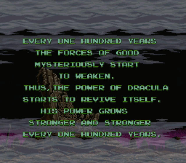
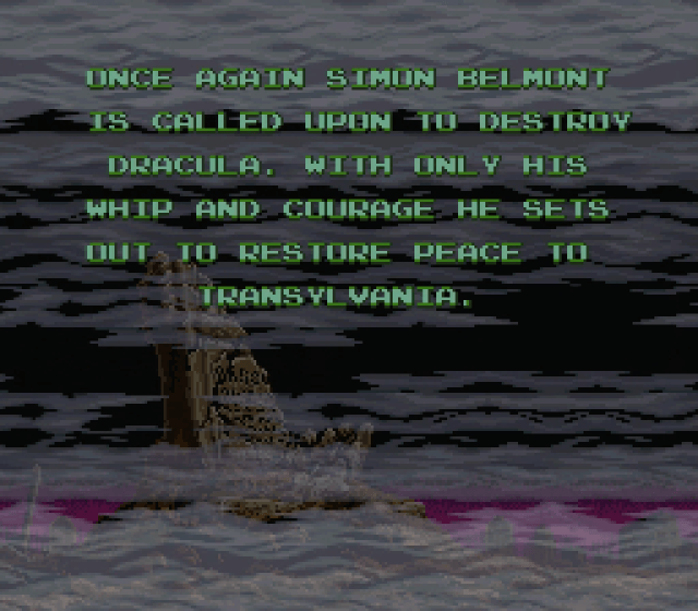
So, that’s a little weird. The opening crawl establishes the concept of Dracula returning to life on a 100-year cycle—a plot nugget that would become the backbone of the franchise when Koji Igarashi tried to lock down a firm timeline more than 20 years later—but it also says Simon Belmont is called upon to stop him “once again.” So evidently Simon not only didn’t die from his curse in Castlevania II, he ended up living forever!?
Well, no. Despite what it says on the title screen, this is not chronologically the fourth Castlevania game. In Japan, the creators’ intentions were much clearer right from the start: There, the game’s title was simply Akumajou Dracula, exactly the same as the title of the original NES/Famicom Disk System game five years prior. Super Castlevania IV is not a sequel, it’s a remake: A retelling of Simon’s story, informed heavily by the structure and design of Castlevania III.
The original Castlevania may actually be the single most retold/remade video game ever. Super Castlevania IV was actually the second attempt, the first being 1988’s dreadful mess of an arcade game, Haunted Castle. Two years later, Konami attempted a significantly more direct remake on Sharp’s powerful X68000 computer, also called Akumajou Dracula (Castlevania Chronicles in the U.S.); it hewed much closer to the layout and design of the NES game than other remakes, adding material rather than heavily reworking the source material.
(Yeah, this series will touch on that remake as well, briefly.)
As for Super Castlevania IV, it’s a much larger adventure than the original Castlevania. Big enough to warrant a password system, even in the U.S. (where Konami previously figured Americans were cool and tough enough to complete the original NES game without the save system present in the Japanese version).
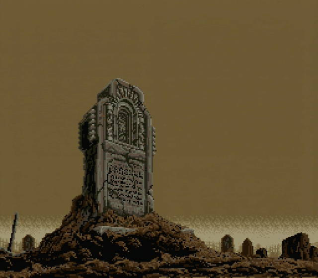
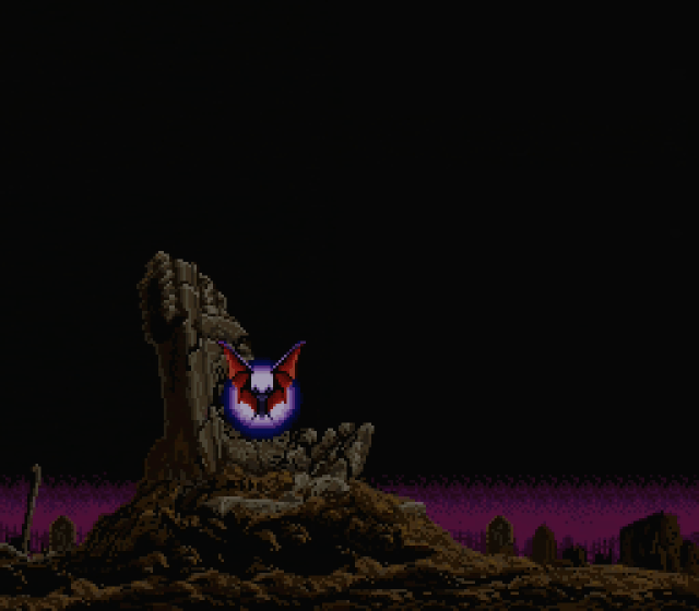
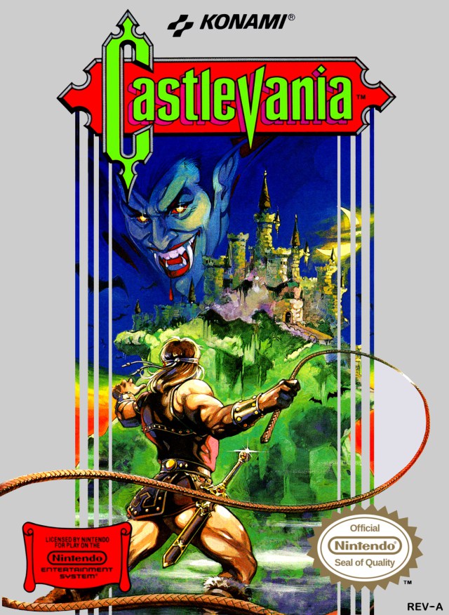
In a nice homage to the source material, the game opens not with a prayer and a rousing fanfare like Castlevania III‘s, but rather a moody tribute to the NES box art:
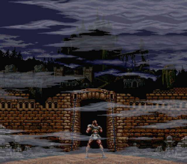
This castle appears much larger than the one on the old box—and, drawing on Castlevania III‘s structure, there’s now a lot of ground to be covered between Simon and the castle proper.
That said, you don’t have to fight through the zombie-infested buildings of Aljiba or Warachiya in order to reach the castle grounds this time; rather, you begin at the outskirts of the castle, and about half the game consists of clearing the extensive ruins and caverns between the outer wall and the keep proper.
From the very first screen, it should be quite clear and obvious that this Castlevania isn’t like its predecessors. Even before you take control of Simon, you can tell at a glance that this incarnation isn’t based on the NES sprite. He’s bigger, and while he still kind of hunches, it’s a more confident hunch rather than the sort of huddled, shrinking-into-himself stance that the NES Belmonts adopted. That introduction at the castle gates wasn’t a cut scene featuring a larger-than-life vampire hunter—it was the actual Simon as he appears in the game.
The difference, clearly, is one of scale. Simon’s sprite on NES was 32 pixels high; as befits the more powerful sprite-handling capabilities of the Super NES, however, he stands 48 pixels high here. This does not amount to a merely cosmetic difference: It has a radical impact on the workings of the game. Some changes wrought by Simon’s increased height are very good, and some are very bad. A games journalist might even call the change a mixed bag.
Simon gains even more height when he attacks—his whipping posture is more upright, and he now raises his arm more. In action, Simon can cover far more of the screen than in the previous version of his quest to destroy Dracula. In fact, this is by far the most capable and powerful rendition of the character ever, outside of his bonus appearances in some of the latter-day IGAvanias (where he commands raw power to make up for his lack of advanced RPG traits).
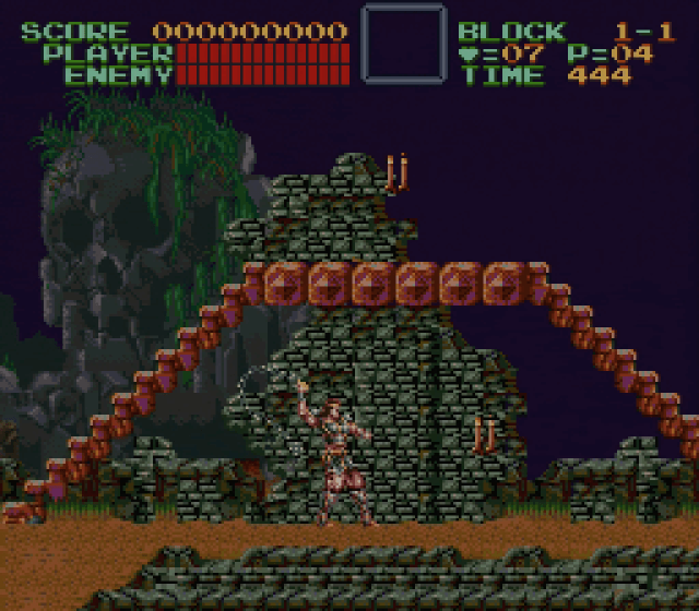
One of his new abilities, for example, is the power to jump onto and off of staircases. More than simply a technique to speed the action along, it also opens up a variety of new tactical and evasive opportunities.
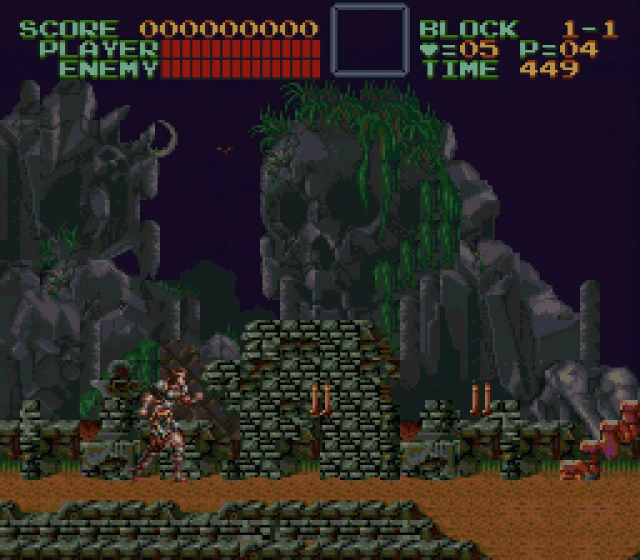
The introductory phase of Castlevania IV hearkens back directly to Simon’s approach to the castle in the original NES game. Before reaching the moat and drawbridge, you first need to pass through a brief area with no active threats and enough magic candles to bring your whip up to full power. The whip upgrade path remains the same as in Castlevania and Dracula’s Curse: The first candle you whip that would normally contain a Heart (to power your subweapon, per usual) will instead contain a power-up that increases the power of your whip. After you collect another five Hearts, the next Heart-bearing candle will drop a second upgrade that adds about 50% to the length of the whip.
What I find interesting about this no-hazard zone is that newcomers to the franchise are more likely to get a feel for all of Simon’s new skills than a veteran. There’s nothing here that forces you to put his new moves to the test, so it would be understandable for a seasoned player to treat it as business as usual. Someone who doesn’t already know the ins and outs of Castlevania, however, will likely be more inclined to experiment and learn about things like multi-directional whipping.
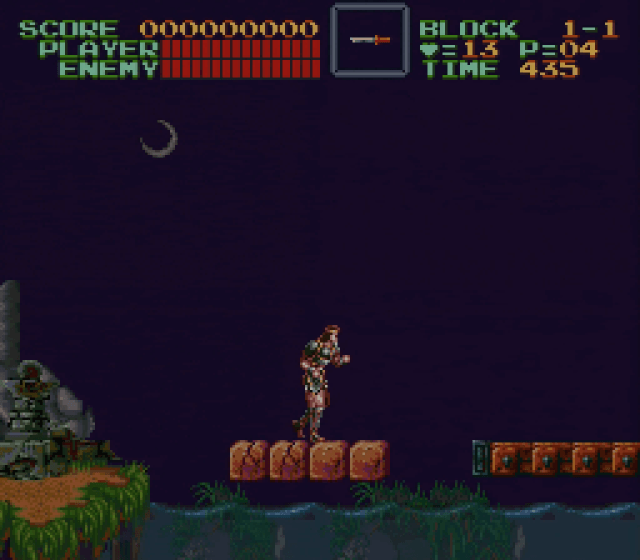
Ah, but that would be getting ahead of ourselves. In order to cross the moat, Simon has to deal with the one tiny hazard in this section: A platform of bricks that crumble as you cross them. With nothing to collect in this screen and no other threats present, these four bricks simply serve as a warning of future dangers to come under more harrowing circumstances.
Still, Castlevania literati may notice something about these bricks: There’s nothing holding them up! The thoughtful architectural discipline of the original Castlevania and its second sequel have already been cast aside; the first game in particular went to great lengths to place background elements in conjunction with traversable surfaces to make it clear that the platforming challenges you had to undertake were the result of ancient masonry falling away rather than video game magic. Castlevania IV doesn’t discard that philosophy altogether, but it definitely lacks the scruples of the classic it aims to remake.
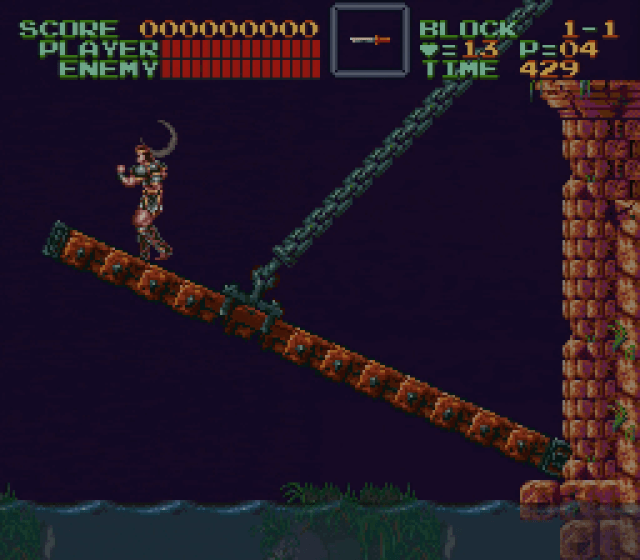
Unlike in the original Castlevania, the entrance to the castle doesn’t merely consist of a door for you to walk through. No, Konami has fancy hardware tricks at their disposal, and the gate to the castle now involves a massive door/drawbridge that begins to rotate closed once you set foot on it. It’s the first of many Super NES-specific visual gimmicks Castlevania IV has up its sleeve, and it’s a good one. The bridge rises slowly but inexorably, and the finality of its closure creates a sense of no escape. Not that you’d be backtracking in a linear 2D platformer like this, but there’s something to be said for the psychology of the whole affair.
Next: Theme of Simon
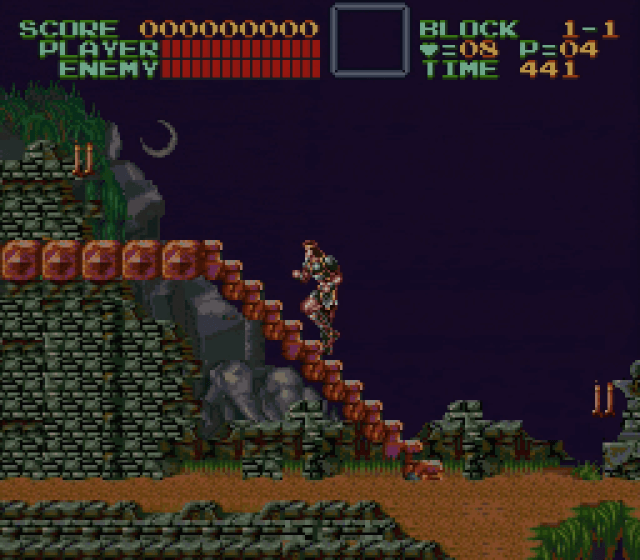
Can you jump off the staircases? Last time I played I was able to jump on perfectly, but it seemed like rather than jumping off, Simon would just freeze in place when I hit the jump button (which I suppose has its uses, if rarely). *shrug*
By pressing down and jump you can drop off staircases instantaneously.
experienced players aren’t gonna spend time figuring out everything you can do in that first area CONFIRMED
Oh, finally! Wasn’t expecting you to tackle this one yet; in fact I wasn’t expecting you to do Super Castlevania IV at all! This should be good, the 16-bit era was my favourite era of gaming ever.
Awesome! My favorite Castlevania ever, and one of the first games I ever owned. I think Dawn of Sorrow and Symphony of the Night are the only two Castlevanias that can match this one in terms of quality.
You rate Dawn over Aria? BURN, HERETIC!
Blocks not supported by anything is definitely a bit of a disappointment compared to the first and third games’ attention to architectural detail, but some of the later games have definitely shown it could’ve been much, much worse.
I’m thinking of Castlevania: The Adventure ReBirth, which had at least one or two areas in the second stage where water was used as a bottomless pit, and the connection to the next set of screens was a staircase…going down into the death water…to a screen that isn’t even underwater. I still like the game, but jeez, you’d think even for a budget release there would be somebody on the team who realized how stupid a screen connection that was.
I always figured it was maybe the parallax scrolling that led to a disregard for the floating platform thing — at least, after reading something about the differences between Kirby’s Adventure and Nightmare in Dream Land on Gamespite some years ago.
Yeah, the whole placement as a sequel in the west struck me as odd. Maybe Konami didn’t think we were ready for remakes/retellings yet?
Glad to see both the return of Anatomy as well as a delightful choice to begin with on Halloween.
Of course, given the series’ current status, the sight of classics like this also just twists the knife a little bit more.
Halloween is the night when the dead rise…
Good point!
Aw, yes! My other favorite game series after Metroid. Rondo is probably my favorite of the 16-bit entries, and it wasn’t until earlier this year that I finally obtained a physical copy of the original game. All three games have pluses and minuses, but all three stand as some of the best of their kind for each system. Very excited to read this series.
The first screen that you’ve covered here is also a good example of the small details that the CV team liked to hide in the background for those who are inclined to look. Here, it’s the tiny bats that fly out of the skull-shaped mountain. They totally didn’t need to create a special sprite and animation for this one scene, but they did, just to reinforce the spooky atmosphere…I love it..
Ahhhhhh, Anatomy is back! I know you’ve had mucho other projects going lately but this is my favorite, so, thank you! Glad to see it back, and with such an interesting game for the series too (design decisions for 16 bit and all).
Yess! Loving your Anatomy series, Jeremy. Keep up the great work!